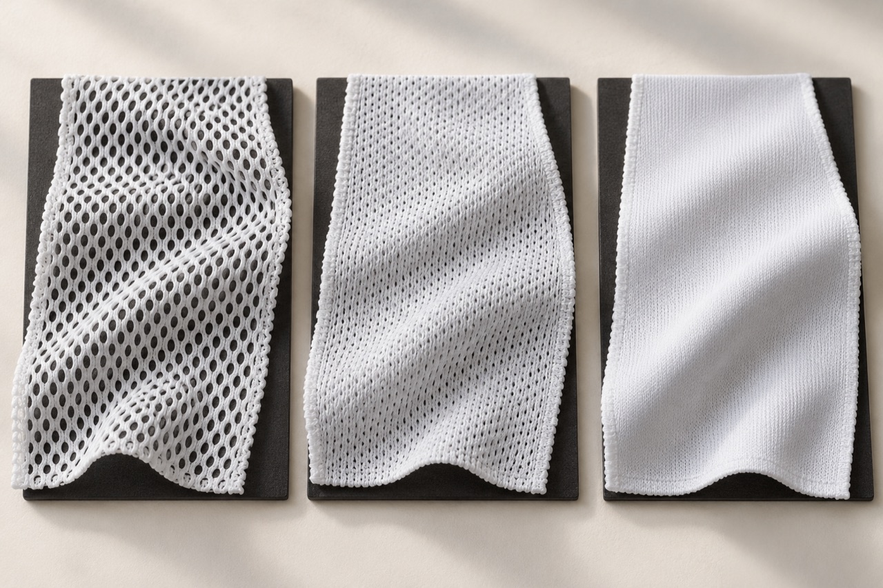
A white jersey may look reassuringly solid on a white table and reveal a contrasting base layer as soon as it is worn. For a product developer, the useful question is specific: what should remain covered, in which part of the garment, and under what conditions?
Define the coverage requirement first
A lightweight cycling top worn over bib straps has a different brief from a school match shirt. Decide whether a dark base layer, a skin-tone contrast or the outline of another garment is the concern. Also identify where coverage matters most. The answer may differ between the chest, back and ventilation panels.
This discussion is more useful than the instruction “make it non-transparent.” A clear brief lets the development team compare samples against an agreed expectation rather than personal impressions.
Weight does not describe every opening in a knit
GSM tells you mass per unit area. It does not, by itself, describe how yarns cover the fabric surface. CottonWorks defines fabric tightness, or cover factor, in relation to the covered and open areas of a textile. That is a useful distinction when comparing two fabrics with similar weights but visibly different structures. CottonWorks: Fabric Tightness.
Inspect the actual swatch against a consistent background. Look at the size and distribution of openings, the appearance of the yarns and the way the material drapes. Keep opacity observations separate from assumptions about softness, strength or drying performance.
Review the fabric as it will be worn
A flat swatch is only the starting point. A fitted shirt places the material under different tension at the chest, shoulders and back. Test the proposed pattern in the intended size rather than stretching a loose swatch until any fabric becomes transparent.
Include a damp-condition review if the garment will be worn during sustained exercise. This is a practical development recommendation, not a claim that every fabric changes by the same amount when wet. Keep the wetting procedure consistent and record what was done.
| Review condition | Keep consistent | Record |
|---|---|---|
| Dry, relaxed swatch | Lighting, backing and camera exposure | Visibility of the chosen backing contrast. |
| Finished garment in motion | Intended size and repeatable movements | Where coverage changes as the wearer reaches or bends. |
| Damp sample or garment | Documented wetting and viewing conditions | Appearance changes in the areas relevant to the design. |
“See-through” needs a more precise description
When someone calls a white jersey transparent, ask what they can actually see. The concern might be a dark base layer, the outline of a sports bra, a difference between skin and clothing, or a high-contrast object behind an unworn swatch. These are related observations, but they do not set the same product requirement.
Also ask where the concern occurs. A ventilating upper-back insert may be intentionally more open than the front body. A wearer might accept that difference at the back but dislike it across the chest. Describing the whole garment with a single opacity label hides those local expectations and makes a targeted correction harder.
The viewing situation matters. A jersey against a white tabletop, on a dark mannequin and on a moving wearer presents three different comparisons. None is inherently the complete truth about the product. Record the backing, lighting and fit so that another reviewer can understand the observation rather than judge an isolated photograph.
A useful brief might state that the front panel should provide acceptable coverage over the intended base layer during the specified movements. That still requires agreement on what acceptable means, but it identifies a real wearing condition. “Never see-through” promises much more, across undefined bodies, lighting, layers and movement. Product development works better when the requirement describes the actual use.
Learn what the GSM figure leaves out
GSM is a mass measurement, not a complete map of a textile. It does not tell the reviewer where the yarns sit, how large the openings appear or how the fabric changes when placed under tension. That is why the weight figure should sit beside a physical swatch and a construction description, rather than stand in for them.
Compare two candidate whites against the same contrasting backing. Look for differences in the size and distribution of visible openings. Then inspect both fabrics without the backing to assess surface character and drape. Keep the observations separate: one sample may appear more covering while another feels softer or falls more fluidly. None of those impressions establishes the others.
Avoid creating a universal GSM threshold for white jerseys. A figure that worked for one construction and fit may not transfer to another. The useful record identifies the actual fabric reference, finished colour and relevant review conditions. If the material changes, repeat the coverage review instead of assuming that a matching weight preserves the result.
This approach also improves conversations about alternatives. Rather than asking only for “a heavier white,” explain which region or condition fails the brief. The material specialist can then propose candidates with a clearer understanding of the problem. Weight may change in the solution, but it becomes one documented variable rather than the entire design strategy.
Flat fabric and worn fabric answer different questions
A relaxed swatch reveals the material without the complexity of garment fit. That is useful for initial screening. It cannot show how the fabric behaves across a chest, shoulder or bent back when the pattern places it under tension. The finished garment is therefore essential to the final coverage decision.
Use the intended size and fit category. A close-fitting performance shirt and a relaxed training top distribute fabric differently around the body. If the wrong size is used during review, the result may describe a fit mismatch rather than the proposed product. Record the relevant body measurements and garment size according to the project’s normal fitting process.
Choose movements that expose realistic changes: reaching forward, lifting the arms or taking the sport’s usual posture. Observe the actual areas of concern. There is little value in pulling a swatch far beyond normal use until it becomes visibly open and then presenting that as the wearing result.
Fit changes should be considered carefully. Adding ease in one area may improve the observed coverage while changing the silhouette or movement elsewhere. Review the whole garment after a pattern adjustment. The objective is not to eliminate all fabric tension; it is to create the intended fit with acceptable coverage in the conditions the design is meant to serve.
Damp appearance belongs in the brief when it matters
For a shirt intended for sustained exercise, a dry-only review may leave an important wearing condition unexplored. Include a damp appearance assessment where relevant, but define how it is performed. Randomly splashing one swatch and thoroughly soaking another does not create a useful comparison.
Record the wetting method, the condition at the time of viewing and the areas examined. Keep the backing and lighting consistent with the dry review where practical. Describe the observation directly: a particular underlying contrast became more noticeable, or one region changed more than another. Avoid assuming every white fabric responds in the same way.
A damp review also needs a garment perspective. Contact with the body, fit and the distribution of moisture can differ from a loose swatch laid on a board. Use swatches to screen options, then examine the relevant finished sample. Where a controlled performance claim is required, seek an appropriate professional evaluation rather than promoting an informal demonstration as a standard test.
Do not use a dramatic wet photograph without explaining its conditions. It can be informative, but it can also make a product look better or worse through uncontrolled backing, exposure or tension. The aim is a decision the team can repeat. A modest, clearly documented comparison is more valuable than a striking image whose setup nobody can reconstruct.
Lighting can change the conclusion before the fabric changes
White fabrics are especially easy to misjudge when photographed under different conditions. Automatic exposure may brighten one image, darken another or reduce visible detail. A light behind the garment can reveal openings that are less obvious under front lighting. These differences need to be controlled or at least recorded before comparing photographs.
Choose a consistent viewing arrangement for development. Use the same background, camera position and lighting direction, and avoid changing the image treatment between samples. Keep an unedited reference image where practical. If the final product will be photographed for a catalogue, distinguish that presentation task from the coverage assessment.
Inspect the sample physically as well as on screen. A photograph can support communication, but screens differ and cannot reproduce every viewing condition. Where reviewers are in different locations, send enough context to understand the setup and retain the same physical reference materials. Do not ask someone to make a precise product decision from a cropped image with no information about what is behind the fabric.
The record should make a simple question answerable: did the fabric change, or did the way we viewed it change? Once that is clear, the team can discuss coverage with far less ambiguity. Consistent photography does not create a formal opacity measurement, but it removes several avoidable sources of disagreement during sample development.
Place ventilation where its visual effect is acceptable
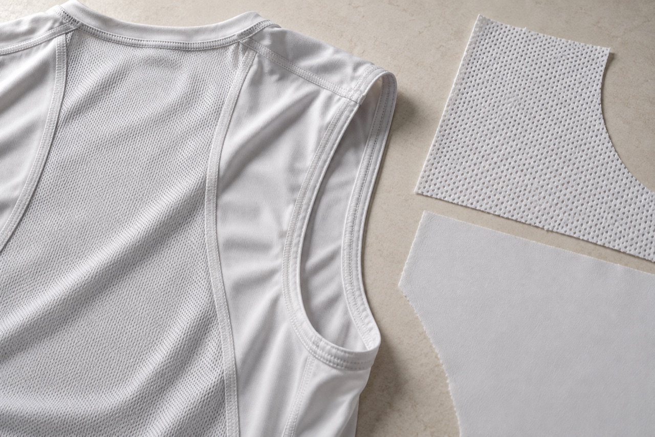
A shirt does not have to use one fabric everywhere. Different panels can serve different design intentions, provided their joins, appearance and wearing behaviour work together. If an open panel is proposed for ventilation, evaluate its location and visible contrast as part of the finished white colourway.
Start with a body map of coverage expectations. Identify the regions where the wearer wants greater concealment and the areas where a more open appearance is acceptable. Review the map with the actual garment pattern. A panel that looks discreet on a flat drawing may become more prominent when the wearer moves or when a base layer creates contrast beneath it.
Check the transition between materials. A denser main body and a more open insert may differ in surface texture, shade and drape. The seam can add another visible line. Decide whether that contrast is an intentional design feature or something the product should minimise. Either choice can work if the sample supports it.
Avoid assigning performance claims from appearance alone. An open-looking panel may suggest ventilation, but a visual inspection does not quantify air flow, moisture transport or thermal comfort. Name the construction accurately and obtain relevant evidence for any specific performance statement. Panel mapping is a useful design tool; it does not remove the need to evaluate what the chosen materials actually do.
A second layer changes more than coverage
Adding another layer in a sensitive area is one possible design route, but it introduces a new assembly. The extra fabric, attachment seams and layer edges can affect feel, drape and appearance. Review those consequences before treating a lining as the automatic answer to a white-shirt concern.
Consider where the added layer begins and ends. Its boundary may become visible through the outer fabric or create a noticeable transition against the body. A partial lining can solve one local problem while drawing attention to another. Examine the garment from the outside and inside, both relaxed and during relevant movement.
The layers also need to behave acceptably together during care. Record their material references and inspect the assembled area after the agreed sequence. Do not assume that two individually satisfactory swatches remain satisfactory when joined. The sample should show whether the intended shape and surface remain consistent across the lined and unlined regions.
Compare the layered option with alternatives such as a different main fabric, revised panel placement or an appropriate fit adjustment. The best answer depends on the garment’s priorities. If low bulk is central to the brief, that constraint should remain visible in the decision. Coverage is one requirement among several; a successful solution improves it without quietly abandoning the rest of the product.
“Breathable” should not carry every comfort claim
Product conversations often compress several different questions into the word breathable. Does air pass through the fabric? Does it spread liquid moisture? How quickly does it dry under defined conditions? How does the wearer experience the complete garment? These questions may be related in use, but one observation does not answer all of them.
Keep the coverage comparison separate from those performance questions. A fabric that reveals less of a dark backing has demonstrated only that appearance under the review conditions. It has not automatically demonstrated worse drying, better comfort or a particular level of ventilation. Likewise, a visibly open knit does not provide a complete comfort assessment.
For the product brief, write down which properties matter and why. A short indoor session, a long outdoor ride and a school sports uniform can place different emphasis on weight, coverage and moisture behaviour. That does not require a long list of marketing features. It requires choosing the relevant questions and obtaining evidence appropriate to them.
When a formal performance claim is planned, identify the method and tested material behind it. When the evidence is an informal wear review, describe it as such. Keeping those boundaries clear allows the article and product page to explain real design choices without turning a visually appealing fabric into an unsupported all-purpose performance solution.
A worked example: the front looks fine until the wearer reaches
Imagine a white training top that appears satisfactory on a table but shows a dark base layer more clearly when the wearer reaches forward. The back ventilation panel is acceptable, and the concern is concentrated across the upper front. This is a hypothetical development situation, not a reported trial.
First, confirm the intended size and base-layer arrangement. Photograph the relaxed and reaching positions under the same lighting. Check whether the change is associated with the pattern’s tension in that region. A flat swatch comparison can then help distinguish the material’s relaxed appearance from the additional effect observed in the garment.
The next samples might compare a revised front fabric and a modest pattern adjustment, evaluated separately. Keep the back panel unchanged if it already meets the brief. This makes it easier to see whether the correction comes from the material, the fit or both. A fully redesigned shirt would make that learning less clear.
Evaluate each candidate for movement, silhouette and coverage, including damp conditions if relevant. If the preferred option improves the front but creates uncomfortable tightness elsewhere or an unwanted material contrast, development is not finished. The goal is a balanced garment, with the specific coverage concern resolved under the intended conditions rather than hidden in a more flattering photograph.
Review the white colourway as its own product
Approving a navy jersey establishes useful information about pattern, assembly and general appearance. It does not settle the coverage of the white version. Treat the white colourway as a separate sample review, using its actual fabric, trims and decoration rather than assuming colour is the only changed variable.
Look at the entire assembly. Neck tape, seam allowances, labels and darker internal components may become more visible through a white body. A large crest or sponsor panel can create a locally different appearance from the surrounding fabric. Decide whether these contrasts are acceptable parts of the design and record them explicitly.
Check relevant sizes and fit situations. The smallest garment is not necessarily the most demanding case, and a single mannequin may not show the concern that prompted the review. Choose the sample set around the actual wearer group and product use rather than around whichever sample is easiest to photograph.
Retain the approved white sample with its viewing notes and base-layer reference. This gives later reviewers a concrete comparison when a new fabric lot or construction revision is considered. The approval becomes more than “white looked okay”: it records which product was seen, how it was worn and which appearance was accepted.
Does a dark print make the white fabric more opaque?
A printed area can change the visible contrast, but that should not be treated as proof that the underlying white construction meets the coverage brief everywhere. Inspect the undecorated regions and the transitions around graphics. If the design is revised later, repeat the relevant appearance review. A sponsor panel that conceals one small area is not evidence for the chest, back or sleeves as a whole. Approve the fabric and the finished design together, while keeping their contributions distinguishable.
Make the final coverage decision usable
The final record should identify the garment region, the relevant wearing condition and the approved appearance. Include the actual fabric reference, size, fit and any panel or lining choices. If a formal method is part of approval, retain its report separately from informal photographs so the two types of evidence are not confused.
State unresolved conditions plainly. A dry sample review does not cover damp use; an assessment over one base layer does not establish every possible combination. These limits need not make the product description cumbersome. They simply prevent an absolute claim from outrunning the evidence.
For an article, the useful message is that white-jersey development is a balance of construction, fit and viewing conditions. For a sample room, the useful output is a reference that another person can reproduce. Both are more informative than a universal weight recommendation, because they connect the material choice to the actual garment and the wearer’s expectations.
Keep comfort claims separate
A less transparent fabric is not automatically the more comfortable choice. Likewise, the word “breathable” does not establish moisture transport or drying speed. AATCC lists absorption, wicking and drying assessments separately in its testing catalogue.
Compare the garment’s coverage requirement with its intended climate, fit and movement. Potential design routes include a different knit, a less strained fit or a more selective use of ventilation panels. Each needs a sample review because changing one feature can change the feel or appearance of the whole shirt.
Approve the finished white colourway on its own merits. Approval of a dark jersey does not answer the coverage question for white. Keep the chosen reference sample and the viewing conditions with the product specification so the decision can be repeated meaningfully.
Technical references and question evidence
- TechnicalCottonWorks: Fabric Tightness
- TechnicalAATCC: distinct moisture-management test categories
- Question evidence onlyWhite cycling jersey transparency discussion
Technical references support the discussion method. Question evidence documents public discussion of an issue; it does not diagnose a KITOEM product or establish a test result.