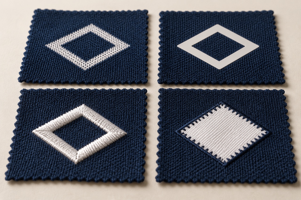
A raised club crest can look excellent on a presentation jacket and feel distracting on a light match shirt. A flat printed design may suit a large graphic but lack the texture wanted for a heritage-style jersey. The right decoration starts with the garment’s use and the size and position of the artwork.
First, describe the construction accurately
“Heat printed” is not precise enough. Dye sublimation uses heat to transfer dye into suitable polyester material. A film-based heat transfer leaves an additional layer on the surface. Both involve heat, but the finished structures differ. Sawgrass explains the material basis of sublimation in its sublimation overview.
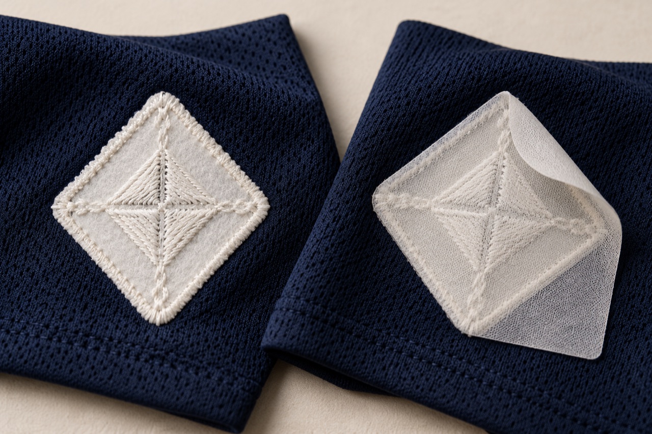
Embroidery forms a design with stitches. Appliqué places a separate piece of fabric onto the garment, commonly secured with stitching and sometimes supported by adhesive. An embroidered patch attached by heat combines more than one process. A jersey can therefore be sublimated through the body, carry a separate crest and use another method for its player name.
Judge the actual area covered
A small transfer at the hem does not tell you how a full chest graphic will feel. Review each option at the intended size. Bend the decorated panel, handle it from both sides and try the garment during the movement it is designed for.
| Method | Detail worth examining | Question for the sample review |
|---|---|---|
| Dye sublimation | Fabric texture, colour detail and panel alignment | Does the design remain clear across the actual knit and sewn panels? |
| Surface heat transfer | Film thickness, edge finish and movement | Does this particular transfer move comfortably with this fabric? |
| Embroidery | Stitch build-up, small lettering and reverse side | Is the finish clear without excessive stiffness or uncomfortable backing? |
| Fabric appliqué | Layer weight, perimeter stitches and corners | Are the edges secure and the complete design comfortable at full size? |
The back of a crest is part of the product
Front photographs can make two embroidered designs look comparable while hiding very different backing and stitching. Madeira identifies the choice of backing, thread and, where needed, topping as relevant to both embroidery quality and wearing comfort in sports and performance wear.
Turn the sample inside out. Look at the backing outline, trimmed edges and position against the body. Consider whether the shirt is normally worn against skin or over a base layer. This changes how much attention a wearer may give to the reverse side.
Start with what the wearer should see and feel
Before choosing a process, describe the finished effect in ordinary product terms. Should the crest sit almost flush with the fabric, have a visible stitched border or feel substantial when touched? Should a player number remain flexible over a broad panel? Is the artwork intended to look sharp from the touchline, reveal fine detail at close range, or do both? These questions translate the visual brief into something that can be sampled.
The same club identity may need more than one interpretation across a collection. A lightweight playing jersey, a warm-up jacket and a heritage supporter shirt do not necessarily benefit from identical decoration constructions. Consistent branding can come from a shared outline, colour relationship and placement while allowing the physical execution to suit each garment.
Separate essential identity features from optional texture. A club may consider its small founding date indispensable, while accepting that a background fill changes from stitched to printed. Another design may depend on the raised border itself. Knowing which feature matters prevents the sample room from preserving the wrong detail at the expense of comfort or legibility.
A useful brief therefore describes the artwork and its intended behaviour together. “Soft crest with readable small lettering, worn directly against skin” gives more direction than “high quality embroidery.” The process can then be selected and refined against an observable result, rather than used as a shortcut for quality.
Sublimation keeps the fabric surface central to the design
Because sublimation colours a suitable substrate rather than adding a separate decorative film, the underlying knit remains a major part of the visual result. A smooth face, an obvious mesh texture and a patterned knit can make the same artwork look different. Evaluate the image on the actual fabric reference instead of approving colour and detail only on paper or a screen.
Look closely at fine lines and small reversed lettering. Are the spaces within letters distinguishable at the intended size? Do thin stripes remain visually continuous across the surface? The answer depends on the complete print and fabric combination. A digital file can contain detail that is less convincing when translated onto a textured textile.
Panel construction introduces another question. If a stripe or geometric motif is intended to continue across a side seam, judge that relationship on a sewn garment. The artwork has to coexist with the pattern pieces and seam allowances. A beautiful flat printed panel does not show whether the completed shirt delivers the intended alignment.
Also inspect the garment while it moves. A graphic can appear orderly in a flat photograph and change as the fabric stretches around the body. This is not automatically a fault; it may be part of the expected wearing appearance. What matters is deciding which visual relationships must remain convincing and checking them on the actual fit. Do not promise that a printing method makes the base fabric immune to abrasion, snagging or other wear.
A heat transfer is a family of constructions
The term “heat transfer” can refer to very different products. A thin cut film, a printed transfer and a substantial shaped emblem should not be assumed to share the same thickness, surface feel, stretch or application requirements. Identify the specific product system before comparing it with embroidery or sublimation.
At the sample table, start with the perimeter. Is the edge clean and visually appropriate to the design? Does it catch the eye because of thickness or a contrasting outline? Then inspect broad filled areas and narrow details separately. A construction that works attractively for a compact logo may feel different when enlarged into a full sponsor panel.
Move the decorated fabric gently and compare its drape with an undecorated area of the same garment. Notice whether the panel forms a broad fold, remains supple or feels locally stiff. These observations are more useful than ranking products by thickness alone. Thinness may be desirable, but the brief can also require opacity, texture or a dimensional effect that must be evaluated alongside it.
Application quality remains part of the finished product. Material compatibility and the supplier’s specified process need to be established on the real jersey. A successful sample made on another fabric does not settle this. For a mixed-decoration shirt, record which marks use which transfer system so that appearance and care questions can be traced to the correct component.
Embroidery translates artwork into a stitch structure
An embroidery file is more than a picture sent to a sewing machine. The design must be interpreted as stitches on a particular fabric. Madeira’s guidance for performance wear discusses adapting digitising, support materials and thread choices to lightweight functional textiles. The implication for development is straightforward: a crest that looks good on a stable fabric deserves a new review when moved to a lighter jersey.
Inspect the outline first. Does it follow the intended shape, or does the surrounding fabric pull into visible ripples? Look next at corners, narrow spaces and small letters. A dense-looking finish can conceal details rather than improve them. More thread is not an automatic route to greater clarity or a better wearing experience.
Consider how the stitched areas are distributed. A mostly open emblem with a stitched border differs from a solid filled badge of the same outside dimensions. When comparing samples, describe the actual filled area, stitch character and backing. Otherwise, “embroidered crest” groups together constructions that can feel quite different on the body.
Finally, turn the garment over. The wearer experiences the reverse side as well as the visible face. Neatly trimmed backing, secure thread ends and an appropriate contact surface deserve the same attention as front-side colour matching. A front photograph can approve the artwork; it cannot complete the comfort review of embroidery worn next to skin.
Appliqué brings a separate fabric into the assembly
In an appliqué design, the applied fabric becomes another product component. Its face texture, edge treatment, flexibility and response to care must work with the jersey beneath it. A bold twill letter may be exactly right for one design, while the same construction feels too substantial for a light training shirt. The method does not decide the answer by itself.
Look at the perimeter under gentle movement. Does the edge remain visually tidy? Are the corners secure? Does the stitching follow the intended outline without making the underlying body look distorted? Examine both the long straight sections and tight internal curves, because a design can look satisfactory in one area and less convincing in another.
Layered appliqué deserves a full-size sample. An outer border, inner letter and additional embroidered detail create a different assembly from a single fabric shape. The visual effect may justify the extra substance, but that should be a deliberate choice. Do not assess the construction from a miniature sample and assume it will feel the same across a large back number.
Review the reverse side and the garment’s hanging shape after the agreed care sequence. The question is whether the components continue to work together, including at the edges and intersections. If the design uses adhesive as well as stitching, identify both elements. Calling the decoration “sewn on” should not hide other parts of the construction that affect its production or care requirements.
Small lettering is where process comparisons become useful
Fine text exposes the difference between approving artwork and approving a physical decoration. Letters that are perfectly readable in a vector file may lose their counters, spacing or separation when made small on a textured jersey. Enlarge the artwork for inspection, but make the final legibility decision at the actual finished size.
Choose one demanding section of the crest as a comparison sample. It might contain a date, a narrow ribbon or a small reversed word. Produce the relevant candidate constructions on the intended fabric, with the same overall dimensions. Compare the result from normal viewing distance and close up. This reveals the tradeoff more clearly than unrelated supplier samples.
Do not rely on a universal minimum letter height. The typeface, stroke shape, substrate and chosen production system all affect the result. A specialist may recommend simplifying the lettering, changing its spacing or interpreting a detail differently. Keep a record of those artwork changes so the approved version is not confused with the original file.
Sometimes the best decision is to separate functions. A textured crest can carry the main identity while a printed detail preserves very small information elsewhere. Sometimes a single process achieves the brief more cleanly. The point is to make the smallest necessary design compromise consciously, with the physical sample visible, rather than discovering it after the decoration has been applied to complete garments.
Colour consistency is a relationship between materials
A printed red, an embroidery thread red and an appliqué fabric red can appear different because they are different physical surfaces. The comparison should consider the intended colour reference and viewing conditions, but also the role each element plays in the overall design. A matte body and a lustrous stitched border may never look identical in every photograph.
Place the candidate decorations beside the actual jersey colourway. Review the complete combination under consistent conditions. Avoid approving one component on a phone screen and another from a physical swatch without acknowledging the difference in evidence. Where close colour matching is essential, establish an appropriate professional colour evaluation procedure with the parties producing the materials.
Check light and dark backgrounds separately. A white emblem on navy raises different questions from the same emblem on white. Surface coverage, outline visibility and any underlying pattern all matter. If the artwork includes a border intended to separate the crest from the shirt, judge whether that border still performs its visual role on every approved colourway.
The aim is a coherent identity across the garment, not an unsupported promise that different materials will look identical under all lighting. Retain the approved physical combination. A named colour alone cannot show the texture, gloss and contrast relationships that made the original sample successful. Those relationships are part of the product decision.
Compare comfort without confusing it with appearance
A useful comfort comparison keeps the garment and artwork as consistent as possible. Use the intended location, finished dimensions and relevant fit. If one sample carries a small outline and another a large solid badge, acknowledge that the comparison includes design coverage as well as production method. It cannot isolate the effect of the method alone.
Ask the wearer to describe specific sensations. Does the reverse side feel noticeable when standing still? Does a border press against the body during movement? Does the panel feel restricted when reaching? “I prefer this one” is useful preference information, but it does not identify which physical feature should be preserved in the next sample.
Consider the expected clothing layers. A crest on a travel jacket may rarely touch skin. The same reverse construction on a fitted match jersey may remain in direct contact for an entire session. Evaluate the real wearing arrangement rather than treating every decorated item as if it were a display garment.
Keep visual approval and wearing feedback in separate fields. A construction can be visually preferred but less comfortable for the intended use, or comfortable while failing to reproduce an essential detail. This makes the final tradeoff explicit. It also prevents a strong first impression at the sample table from silencing practical feedback once the garment is actually worn.
A worked example: one identity across three garments
Imagine a club developing a playing shirt, a travel top and a heritage supporter jersey. All three use the same crest outline and colour family. This is an illustrative design exercise, not a description of a completed order. The aim is to show why consistent identity does not require identical construction.
For the playing shirt, the team might compare a lightweight surface transfer with a carefully developed embroidered option. The review would emphasise movement, the reverse contact surface and clarity at the intended size. A winner would be selected from those actual samples, not from a rule that one process is always more professional.
For the travel top, the team might explore a more substantial embroidered emblem because the intended visual character and layering differ. For the heritage jersey, a fabric appliqué treatment could be considered where a visibly layered finish supports the design. Each choice would still need its own review of edges, drape, colour and care behaviour.
The collection could remain recognisably related through proportion, placement and artwork interpretation. The final record would identify how each version is made and which physical sample represents approval. That is a more useful product system than forcing every item to carry the same badge simply because one version was approved first. The identity remains consistent while the construction responds to the garment.
Can several decoration methods share one jersey?
Yes, a garment can combine a printed body, a separate crest and another construction for names or numbers. The practical issue is whether each element suits its own location and whether the complete combination remains coherent. Review the shirt as a whole after approving individual marks.
Check visual hierarchy: the crest, sponsor and player identity should not compete accidentally through mismatched scale, surface character or colour. Check internal contact where stitched elements are present, and identify the care requirements of the complete garment. A successful body print does not establish the durability of a separately attached badge.
Keep each decoration traceable in the product record. This allows a later question about one component to be investigated without treating the entire shirt as a single undefined printing process.
What a useful decoration specification contains
A decoration specification should describe each element independently. Identify the method, actual material or construction reference, artwork version, finished dimensions and position on the garment. Add the desired surface character and any reverse-side requirement. This is enough to start a precise conversation without filling the brief with claims that have not been demonstrated.
For a demanding crest, attach photographs of the approved front and reverse, plus a physical reference where practical. Mark the details that cannot be lost: a letter opening, a border width, a corner shape or a particular relationship between colours. Where variation is acceptable, define it through an agreed review method rather than assuming every viewer shares the same tolerance.
Include the relevant care review and any remaining limitations. If only one size or colourway has been evaluated, say so. If comfort feedback came from a narrow wearer group, do not convert it into a universal claim. The specification should help another person reproduce and evaluate the product, not merely repeat the language of a marketing page.
The strongest decoration choice is the one whose visual effect, contact surface and behaviour have been considered together. Process names are useful starting points. The finished garment is where the decision becomes meaningful.
A textured finish is a design choice, not a quality grade
Embroidery should not automatically win because it is raised. A transfer should not automatically lose because it is flat. Compare the clarity of the actual crest, the garment’s drape and the behaviour of the decoration after the intended care sequence. A process name alone establishes none of those results.
For lightweight playing jerseys, give movement and the full decorated area a serious review. For travel apparel or supporter styles, a more substantial emblem may be appropriate. These are design judgements to validate with samples, not fixed rules for every sport.
When specifying the product, name each decoration separately: method, position, finished dimensions and desired surface character. That gives a much clearer instruction than asking for a “premium logo” and expecting the factory to guess which kind of premium you mean.
Technical references and question evidence
- TechnicalSawgrass: Sublimation overview
- TechnicalMadeira: Sports and performance wear
- Question evidence onlyWearability of sublimated, twill and heat-pressed graphics
Technical references support the discussion method. Question evidence documents public discussion of an issue; it does not diagnose a KITOEM product or establish a test result.